Scatter Plot Maker
Enter the dependent and independent variables in the tool and the calculator will draw the scatter plot graph.
Scatter Plot Maker
This scatter plot maker draws the scattered plot of numeral data with one variable along each of the variables. The scatter plot generator assists to understand the correlation between the two variables.
What is a Scatter Plot?
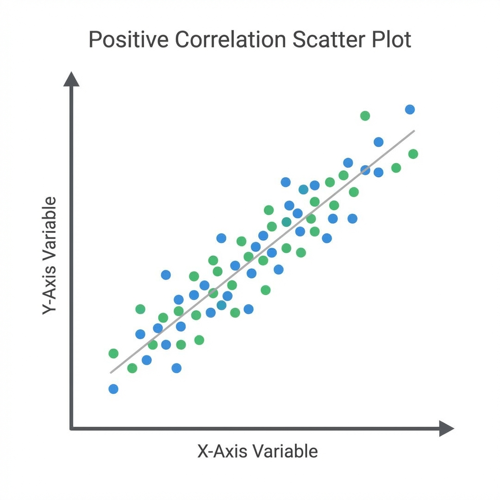
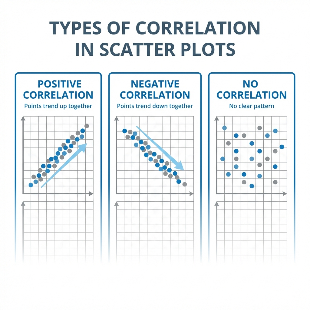
A scattered plot is a type of data representation to show the relationship between different variables. For example, if you are making the scatter plot graph between price and sales with the scatterplot maker. You need to draw the price on the x-axis, and the sales on the y-axis, the correlation may be positive (rising), negative (falling), or null (uncorrelated). The free scatter plot maker provides a simple depiction of the effect of price on sales. The most obvious reason for creating the scattered plot include:
- It provides a visual and statistical resource to test the strength of a relationship between two variables
- Scatter plot generator can be effective in measuring the strength of correlations between two variable and their effect on each other
How to Create a Scatter Plot?
To create scatter plot, there are certain considerations that you need to take into account:
- Draw the scatter plot graph with the independent variable along the X-axis or horizontal line
- Take the dependent variable along the y-axis or the vertical axis
- Create scatter plot by putting a dot or a symbol where x-axis values intersect the y-axis with the xy graph maker. If two dots fall on exact same points, place them side by side.
Scatter Plot Example:
Lets us understand to make a scatter plot with the help of an example given below:
Question:
Draw a scatter plot graph of the given data that represent the number of games played and scores obtained in each instance.
| No. of games | 3 | 5 | 2 | 6 | 7 | 1 | 2 | 7 | 1 | 7 |
| Scores | 80 | 90 | 75 | 80 | 90 | 50 | 65 | 85 | 40 | 100 |
Solution:
- X-axis or horizontal axis: Number of games
- Y-axis or vertical axis: Scores
Now, the scatter graph will be:
Working of Scatter Plot Maker:
Our online scatterplot creator only needs a couple of steps to compute the scatter between the dependent and independent variable. Let's have a look!
Input:
- Enter the data of independent and dependent variable
- Enter the name of the graph and the dependent and independent variable
- Hit the calculate
Output:
- Scatter plot table
- Scatter plot graph
FAQs:
What are the Three Types of Scatter Plot Graphs?
There are three types of scatter plot graph that can generate all three types of correlation with the online scatterplot generator.
- Scatter Plot for Positive Correlation.
- Scatter Plot for Negative Correlation.
- Scatter Plot for Null Correlation.
How do you Tell if a Scatter Plot is Strong or Weak?
The strength of a scatter plot graph is usually weak, or strong. If the spread out points are more then the relationship is weak between the variables. If the points are clearly clustered in the scatter plot creator or around a line then the relationship is described as strong.
References:
From the source of corporatefinanceinstitute.com:Scatter Graph, What is a Scatter Plot? From the source of ablebits.com: Scatter plot, Why create scatter plot?
Related Tools